- Title: Forever Sakura Shopping Bag
- Media: Digital Design
- Size: 12x8in
- Date Complete: Fall 2011
This bag was created in the Illustration class. To create this bag, I simply did a live trace of an image of cherry blossom flowers that I took, reversed the colors and placed the white graphic onto the bag.
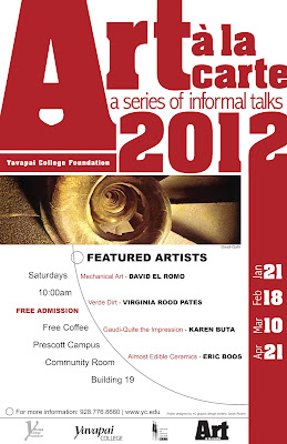
- Title: Art a la carte
- Media: Digital design
- Size 12x18
- Date Complete: Jan. 2012
This poster was created for the yc foundation art a la carte art talks. This was part of a series of work done for them, including the logo and mock brochure. I wanted to keep a clean, eye catching, and easy to read poster that would appeal to all students at YC, regardless of their age or gender.
- Title: Stears Marketing Business card
- Media: Digital design, hand drawn illustrations
- Size: 3.5x2in
- Date Complete: Jan. 3013
This is the business card that i designed for a local marketing consultant. I hand drew the icons, which relate to the services that she provides to her clients. I also had the challenge of designing in two Pantone colors for the logo, icons, business card, and website icons. I am currently working with this client on their website, brochure and future business cards. I loved the project because I was able to come up with my own ideas and present them to the client, rather than the client telling me exactly what they wanted, I had a bit more freedom.


I like the use of hand drawn elements in the business card design, and the halftone pattern gives it texture. I think the color scheme works really well too. Nice job!
ReplyDelete